Versal letters on the web
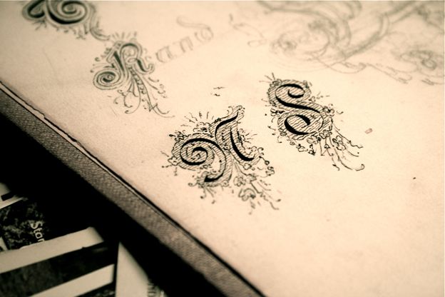
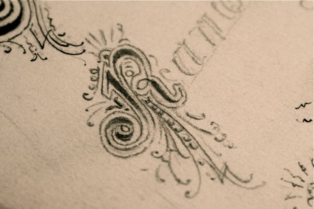
Published • 27 May 2008Yesterday I was going through an old un-named sketch book. Right at the back were these beautiful hand-drawn versal letters and an entire page of weaving ornaments:


Versals, drop capitals or raised capitals are large and often ornately decorated capital letters marking the opening of a running body of text or a verse.
Modern typography has discarded much of these classical decorations in favour of a more clinical page; these particular ornaments above aren’t as multicultural and certainly not as neutral as modern typography which aims to better cater for a larger and more faceted audience.
I would like to see a revival of this form of decoration. I think a lot can be done with typography that currently scores of artists — particularly web designers — are trying to achieve with stock photography and ever popular vibrant, reflective and glossy elements.
Setting versals in CSS isn’t particularly hard. A common method is to use the pseudo-selector :first-letter to refer to the first letter of an element. You can combine this with other selectors to refer to the first letter of the first paragraph of a page, heading, or whatever else strikes your fancy (utilizing the DOM structure properly is helpful in making this work properly). Note Internet Explorer doesn’t recognise many of the CSS 2.1 selectors (IE does however understand :first-letter).
Another common method is to just manually wrap the first letter in span tags with a specific class of desired styling. Whichever you choose, the CSS styling may look something like this:
div#content h2.entry-title + p:first-letter {
    font-size: 4.2em;
    float: left;
    display: in-line;
    text-transform: uppercase;
    }
You may also want to set margins and line-height to better place the versal amongst the rest of the paragraph. The float: left; is optional — it wraps the paragraph around the versal — if you want the versal to stand on the baseline of the opening line of the paragraph then don’t set the float.
Targeting the first letter and styling it was simple; browser consistency is the hair-pulling part. Internet Explorer in particular complicates things because it doesn’t understand the preceding selector (element + first-child). If your versals are vital to the page, see Bill Weaver’s article, Wrangling Drop Caps, which goes into closer detail on the subject including a JavaScript method.
A note of cautioon: when printing a page in Internet Explorer featuring a versal specified using the pseudo-selector :first-letter IE bizarrely displaces other floated elements in proximity to the paragraph. See Nicholas Rougeux’s article Drop caps in the wild for an example.
Finding versal letters with further decoration done other than through size and placement is a rarity on the web. Replacing the first letter entirely with a graphic isn’t impossible but you’re bound to run into many accessibility issues using image replacement on the fly (and getting the right letter — that means designing twenty four versals and some scripting). I did however see a simple method last week of adding a bit more bling to versals by a bright Polish designer:

Piotr Fedorczyk drew ornate background images and placed them behind the versal giving a them that extra love. The only issues here would be visibility of the background image depending on the letter size — an I is smaller in width than a R or Q, and of course text resizing. The CSS now would look something like this:
div#content h2.entry-title + p:first-letter {
    font-size: 4.2em;
    float: left;
    display: in-line;
    text-transform: uppercase;
    background-image: url(../images/versal-bg.png);
    background-repeat: no-repeat;
    background-position: center center;
    }
You can see them in action at Piotr’s site.