About & Contact
Skip straight to: ¶ Personal, ¶ Work or § Colophon.
Simon Pascal Klein

I’m Pascal, a standardista graphic, web and front-end designer, and a rampant ‘typophile’. I was born in Mainz, Germany — the birthplace of Gutenberg — and now work in Canberra as a freelance designer when not studying at the Australian National University. I’m actively engaged in the Open Source community and local web industry, notably as one of the unorganisers to first bring BarCamp to Canberra.
I enjoy drinking in as much good type as I can and have been happily bending beziers since 2004.
I also love friendly email and a good conversation over coffee. Feel free to shoot me an email if you have something on your mind.
10 things about me…
- I’m a freelance web designer with a passion for good typography. Interested?
- I love speaking about my passions at conferences & tweeting about my antics.
- I’m bi-lingual and by nationality German.
- I’m a Leo by star sign; hence the friendly guardian occasionally in the header.
- I try to practice the GTD methodology.
- I practice parkour (l’art du déplacement);
- I work and chill-out to electronic and industrial music;
- I focus on gender/sexuality and political philosophy as majors at the ANU.
- Body modification fascinates me; I love my Ashley piercing.
- I enjoy musing at Essen, my chosen café reading, socialising, & occasionally working.
Work
I am a freelance contract designer specialising in web-based mediums — in particular web applications and web typography. I design both small and large-scale websites, user interfaces, accompanying icons, and provide usability as well and accessibility assessments — for an overview, view a preview of my portfolio.
I have extended a large range of services in the past as part of working as a sole designer for a web development and consultancy company. Now as a contractor I have refined the services I offer to better suit this style of work. I prefer to work with a dedicated team and would be interested in establishing a dedicated position as a web designer for website design or web application projects, and of course anything to do with web typography.
Your upcoming project…
Got an idea bubbling in your head? A site that perhaps needs to be constructed? An app that you would like to build? Do you have to digitise data? I have formulated a handy worksheet (PDF) with some questions about you, your aspirations as a company, and how best to reflect that in your new website or web app. It helps me establish a clearer understanding of your needs. After all design is a communication art — it is vital to understand what needs to be communicated.
I also provide content services—editing, copy-writing. When I do get the opportunity, I do enjoy branching into new domains, going beyond my previous work.
For more information on the services I offer, my workflow, and what to expect when working with me, please download my workflow document (PDF), an extension of the work section on this page. To get in contact, just shoot me an email.
Finally, my curriculum vitae (PDF) is available also for download.
Colophon
kle·pas serves as a personal platform to write about work, studies, typography, and whatever else happens to strike my fancy. It also functions as my (current mini) portfolio.
Typography
The website is built on a base unit of 16, with eleven columns, each spanning 64 pixels with 16 pixel wide gutters, and 48 pixel wide left and right hand margins to hug the page giving a total width of 960 pixels, in absolute terms — the entire design is elastic (just try bumping up the font size).
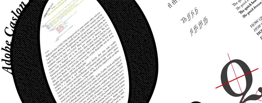
The main body copy column is 544 pixels wide which accommodates for an average of around seventy characters or circa 14–18 words per line per line for the body (at a font size of 16 pixels). The body copy is set in Georgia as designed by Matthew Carter with heading hierarchies and figure captions set in Jos Buivenga’s Museo Sans.
Inspiration
Since discovering the inherent beauty that seems to emanate from ‘plain’ type, and stumbling across the elegance that is Jon Tan’s website, I decided to rethink version 3 of this site. I fell in love with his type folly (see his header and my footer respectively) and wanted to bring the rustic yet clear grace of well-set type to the web. Naturally I drew heavily on various pieces from the print world, but again, Jon Tan, and then John Boardley of I Love Typography.com fame deserve mention in inspiring me in the shaping the visual aspect of this website.
The portfolio slider is a little bit of jQuery magic, using an adapted version of EasySlider.js, which I owe thanks to Ashley Kyd (he writes at ash.ms). Finally I should pass thanks onto Tate Johnson for all the help with Jekyll.
Technical scaffolding
On the technical side the bread and butter that keeps pages and posts together is Jekyll, a Ruby-based static site generator, allowing me to write articles in Markdown. The entire source for this site sits on GitHub, and is open for inspection.
Code-wise, the website is in valid, strict, and semantic xHTML and styled with valid CSS2.1 (it invalidates due to some minor use of CSS3). If you find broken links or anything else you believe is a genuine error please let me know about it.
This is currently version 3 of kle·pas.