Overcoming hurdles in designing for yourself
Published • 09 Aug 2009A little over eight months back I was sitting on the head of a bed in the living room of a tiny flat on level four of this old apartment complex in Kreuzberg, Berlin skipping back and forth between Coda and my browser. I had just waved off a fellow Aussie friend who I had been exploring Berlin with onto her train and returned to amuse myself for another two days before I continued travelling myself. I spent the time hacking on a simple plain-markup template for a new version of this site: version 3.
There were a number of things that irked me about the previous version, from the content, to the aesthetics, and later even the technical: * the new design was just, a new design — I applied it on top of the existing content without much consideration or attention to copy; * the calendar to the side served more to remind me and I think others of how much I neglected putting my thoughts into digestible, attractive posts on a regular basis; * my columns were too compact, particularly the main body column at a width of 450 pixels and font size of 14 — it felt far too much like throw-away copy from a newspaper; * many ‘little things’ bothered me, ranging from anchor (link) colours and various hovers, to the ubiquitous leafy fleuron I used to mark my dates that overall left me with a feeling after a few months of ‘just yet another blog’; * I couldn’t easily tie in a portfolio; * my header and sidebar were fixed with static, pixel-defined heights that occasionally broke, mangling the page depending on the length of dynamic content; * upon wanting to make a number of quick yet sweeping changes I was frustrated with WordPress and the use of dynamic (ugly) PHP hooks.
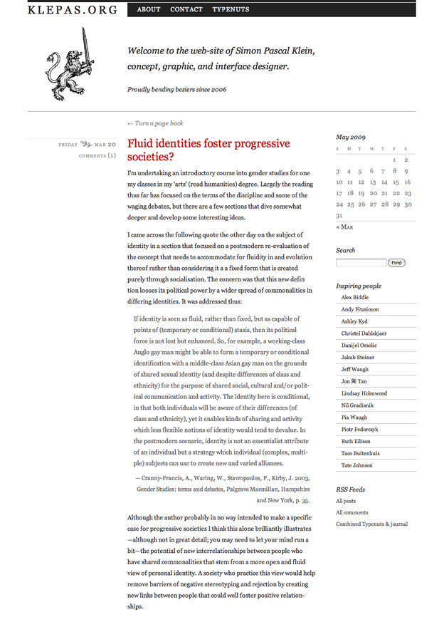
For a glimpse, see a screenshot of version 2.
All these ultimately left me with a feeling of annoyance: I felt like I could do better. By this time also I had left my position with Looking Glass, commenced working as a freelance web designer and presented a few times on the subject of typography. With the points above in mind not long after I got to the point where I felt discouraged to link people to the site particularly as my new beta continued to take shape. I ceased adding new content to the site by the end of March; no new content until version 3 was live was my mantra.
Designing for yourself
How timely that as I write this the current A List Apart Issue (Issue No. 289) features an article by Lea Alcantara on exactly this topic: designing for yourself and redesigning your own web presence. I can personally echo most of the feelings she had concerning a redesign, and importantly came to a similar conclusion: while the “if it ain’t broke, don’t fix it” approach usually holds firm, stagnation in an arena of technologies and approaches that constantly shift requires constant attention if you want to be taken seriously in that discipline.
I ran however into one problem right off that bat: you are your own worst client when designing for yourself. I in fact had exactly the same problem as Lea did, substituting Photoshop with Inkscape (paragraphs condensed):
I opened up Photoshop and promptly froze. It wasn’t the computer or the software stalling, it was me, fingers clutching the mouse and eyes staring blankly at a 1024 × 768 canvas. I filled the screen with color. I wiggled the mouse around. Nothing happened. No, it still wasn’t the computer or the software stalling. It was me. I had to rethink my approach.
It’s a pathetic feeling. You feel like this should just be flowing from your head directly into your hands and into the computer (or onto the paper if that is your starting medium) — I mean, hey, you are designing for yourself, right? This should be simple; you know what your want. Not really. I put forth that designing for yourself is perhaps the hardest thing you can do, and being a perfectionist certainly doesn’t help. There is this obligation to prove yourself; to show your best, and why not — it is your personal web presence by which you intend to sell yourself.
The next hitch I ran into were details. I got bogged down by them, playing with countless variations in styles. There was so much to think about: information architecture, content hierarchies, copy, branding, the back-end CMS and whatnot else. But all these elements are important yet thinking about them in an unstructured way leaves an impression that the job at hand is quite daunting.
The solution? I think the best way of overcoming these problems in designing for yourself is twofold. First assume Cameron Moll’s approach, “Good Designers Redesign, Great Designers Realign” and secondly treat the project as if it were a client project.
Good Designers Redesign, Great Designers Realign
With the advent of the now hundreds of web design/CSS galleries and the web-wide trend in annual complete redesigns Cameron Moll predicted mid-2004 among other forecasts that “Incessant redesigning becomes cessant” (point 5.). Although he wasn’t quite correct in his prediction (incessant redesigning continued after that year) he hit on an interesting idea here which he expanded upon a bit over a year later with his A List Apart article Good Designers Redesign, Great Designers Realign. He argued that the “redesigner” approach is aesthetically driven (paragraphs condensed):
“It’s been 2 years since our last redesign. Our current stuff just looks old. A redesign would bring new traffic to the site.”
Whereas the “realigner” approach is purpose-driven, by content, users, trends or otherwise (paragraphs condensed):
“Market trends have shifted. Should our website be adjusted accordingly? Our users’ needs have changed. Do we need to adapt? We’ve added 3 new sections and a slew of new content to the site over the last 12 months. Are we presenting content as effectively as we can? Our current website does little to convey the strength of our product offering. Does our online presence enhance or devalue our overall brand perception?”
Summarising (bold his):
Thus, the differences between Redesigners and Realigners might be summarized as follows: The desire to redesign is aesthetic-driven, while the desire to realign is purpose-driven. One approach seeks merely to refresh, the other aims to fully reposition and may or may not include a full refresh. (Note that by “reposition,” I mean strategy and not physical location or dimensions.)
If you shift the mindset from throwing everything out and starting anew to adopting changes in responsive manner according to the ‘realignist’ approach you can cut down on the amount of work you perceive you need to do. Rather than designing an entire new site and potentially branding, ensure a need exists in the first place before committing to a realign and determine what changes or additions are required.
Treat the work as a client project
The original title for this article was going to be “Eight months later… designing for yourself”. That figure is right: it was eight months back that I first sat down to work on version 3, and in retrospect treating this work instead as client project should have been a no-brainer. Numerous writers have written on this topic, and incidentally it arose again in the other article of A list Apart Issue No. 289, Erskine design redesign. The author and co-founder of Erskine Design, Simon Collison covers in-depth the process of (I believe) ‘realigning’ their website, and touches also on treating personal work as a client project:
Internal projects drift — we all know it. Client deadlines take precedence, so we ran this as a client project. We designated a proven project manager, a design lead, development assistants, and someone who ensured we covered the legal angle. We ran everything in Basecamp and Backpack. The project was on the agenda for our weekly meetings. The core team reported to the whole team, and took the flack for project slippage.
So, version 3…
Articles
Besides a fresh, and importantly better design, I also decided to ditch most of the existing content. I spent one afternoon going through the 280 blog entries and articles I had written over the last four years and cherry-picked 20 that I felt would continue to be useful and exemplify the style I wanted to pursue in future articles.
I then re-read and edited where necessary all 20 and up-sized their images and diagrams. Examples include Whose Garamond is it anyway?, Tango to go public domain?, and Versal letters on the web.
Comments…
…or lack thereof. As you may have noticed there is no commenting functionality. This is in part due to the use of Jekyll (see further below) as a static site generator that would require me to use a third-party or similar commenting service, and in part due to my personal preference to remove them. Besides not having to deal with them at all (code-wise, styling-wise, spam-wise — yay!) the best ‘comments’ I have ever received were those via email. I echo some of the sentiments raised by Alex Payne in his article Why I Don’t Allow Comments, and More on Everything Buckets in regards to fostering a higher quality discussion. As always feel free to email me.
Typography
The website is built on a base unit of 16, with eleven columns, each spanning 64 pixels with 16 pixel wide gutters, and 48 pixel wide left and right hand margins to hug the page giving a total width of 960 pixels, in absolute terms — the entire design is elastic.
The main body copy column is 544 pixels wide which accommodates for an average of around seventy characters or circa 14–18 words per line per line for the body (at a font size of 16 pixels). The body copy is set in Georgia as designed by Matthew Carter with heading hierarchies and figure captions set in Jos Buivenga’s Museo Sans.
The technical scaffolding
I felt it was time to start from scratch, an not only with the design. I ditched WordPress and upon suggestion from a friend and opted for Jekyll, a Ruby-based static site generator. That sucked at first but proved to be awesome. It gave me the chance to start from a clean slate, meaning new markup and new styling. This allowed me to apply some of the new things I’d learnt in the past year, namely elastic layouts, some new CSS techniques, and weaving microformats into the markup. No WordPress meant no database — all posts reside in plain text files as Markdown.
Code-wise, my aim was to write clean, valid, strict, and semantic xHTML, styled with CSS2.1, with some minor use of CSS3 (everything but the CSS3 validates).
Inspiration & thanks
Since discovering the inherent beauty that seems to emanate from ‘plain’ type, and stumbling across the elegance that is Jon Tan’s website, I decided to rethink version 3 of this site. I fell in love with his type folly (see his header and my footer respectively) and wanted to bring the rustic yet clear grace of well-set type to the web. Naturally I drew heavily on various pieces from the print world but again, Jon Tan, and then John Boardley of I Love Typography.com fame deserve mention in inspiring me in the shaping the visual aspect of this website.
The portfolio slider is a little bit of jQuery magic, using an adapted version of EasySlider.js, which I owe thanks to Ashley Kyd (he writes at ash.ms). Finally I should pass thanks onto Tate Johnson for all the help with Jekyll.