Evaluating kerning
Published • 14 Dec 2008There are thousands of fonts available and identifying the cream of the crop is not just an exercise of picking the most aesthetically pleasing. I constantly drool over new typefaces I come across, and thanks to sites like I Love Typography.com there’s usually a weekly dosage of five to ten that catch my eye. This has already caused a number of impulse-buys. That, and the review of a draft article I was peering over this evening got me thinking, what makes a good typeface?, or rather, what makes a good font? Here are some rough evaluations, besides aesthetic merit:
Unicode character support
- Language support: how broad and faithful is it? (e.g. the correct glyphs for the right characters and availability of the typeface or stylistically appropriate partners in other languages, such as Arabic or Cyrillic);
- Alternate characters: ligatures and stylistic variants (e.g. italic swash versions of z aren’t uncommon);
- Small capitals including small-cap figures (rare);
- Figures: hanging or “old-style”” figures (for use in running text), lining figures, monospaced figures (for tabular work), superior and inferior figures, fraction figures;
- Mathematical operators and Greek letters;
- And more, such as the International Phonetic Alphabet….
Format
The format the typeface is made available in should also be put up to consideration. It is a subject I’m not as familiar with, but general advice reads opting for OpenType over other formats like TrueType. As I understand it, many advanced features like automatic insertion of ligatures (e.g. fi to fi), stylistic variants of characters and more are only accessible in OpenType (provided of course the program you’re using supports the advanced OpenType typography features).
Kerning table
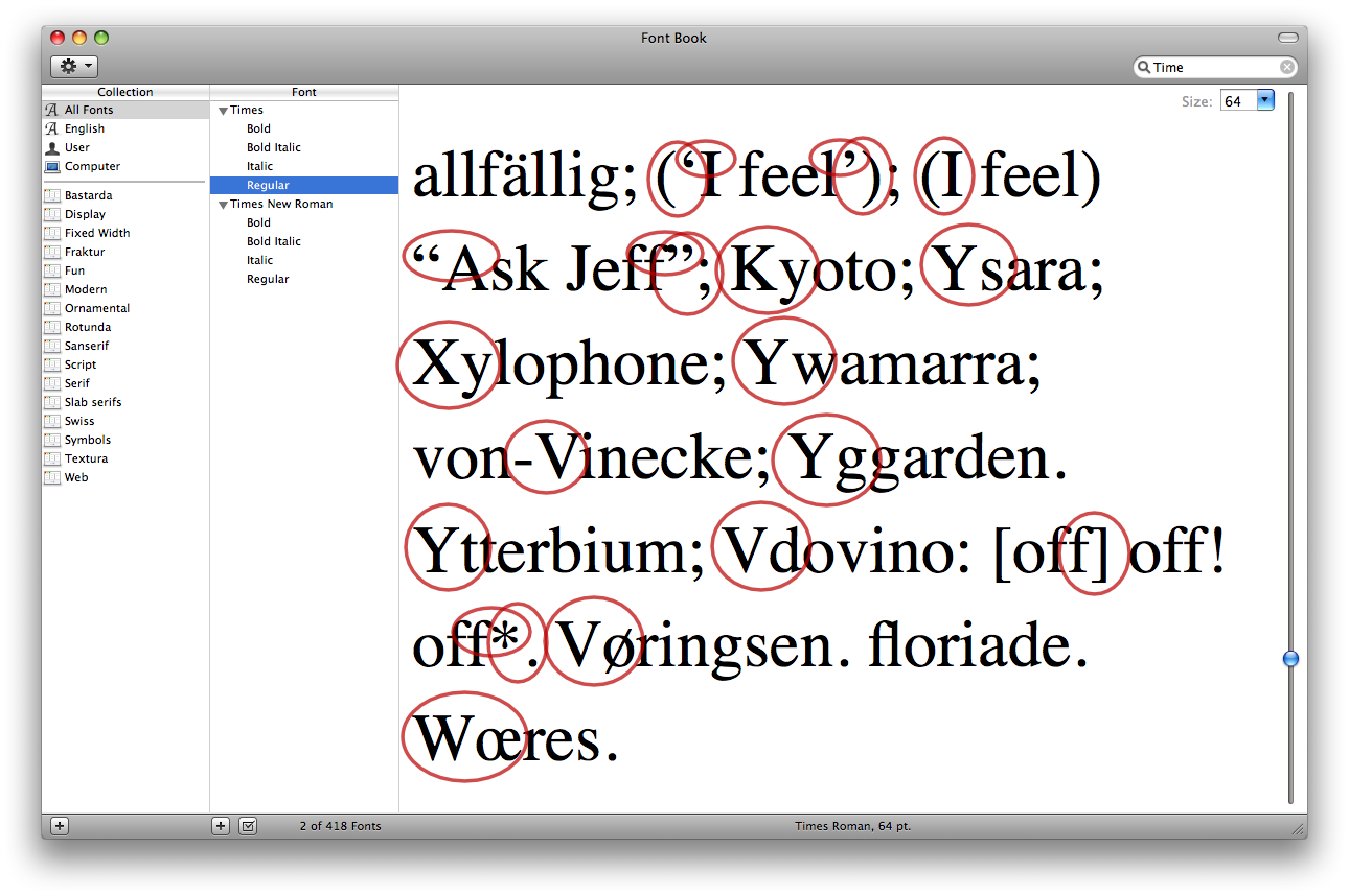
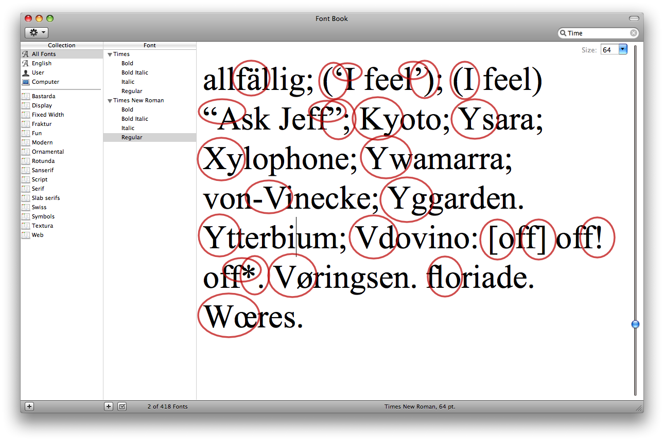
Kerning is the horizontal adjustment of glyphs in a combination of glyphs (e.g. words) to ensure an optically correct fit, eliminating large gaps or tight collisions that occur with some compositions. Notably, f is frequently kerned to the right, as is W and V to remove undesired spaces that would appear on the bottom half of the glyph between common characters that follow it, such as the vowels.
Kerning tables are contained within font files and vary from non-existent to extensive. It is important to note that good kerning tables should ideally accommodate for glyph compositions that occur in other languages.
Besides the drooling over the aesthetics, kerning is usually the other aspect I pay the next most attention to and if possible test. Most seasoned type designers and foundries will supply specimen sheets for their typefaces, often as downloadable PDF files with texts of various languages set in the fonts of the face, at various sizes, styles and so forth. As boring as it might be it is important to have a look over these, native speaker or otherwise — you generally don’t have to understand the gobbledygook: just look out for large gaps between glyphs or ones that lie too close to one another. You might never write actively in more than one or two of the supported languages but nouns like places and people will almost certainly require setting.
If there aren’t various language specimens to check over or a specimen is lacking to begin with, ask to the supplier to throw the font(s) at a kerning test sheet and see how they do. A fun and handy exercise is to go through the fonts in your collection and see how they stack up; here are some of the blatant shortcomings of Linotype AG’s Times and Monotype’s Times New Roman, widely distributed on Mac OS X and Windows respectively:

Times kerning problems (view full size).

Times New Roman kerning problems (view full size).
As you can see Linotype’s Times has fewer kerning issues which is why I prefer listing it before and in addition to Times New Roman in my CSS font-family stacks.
That’s it: I’d be interested in seeing any kerning issues you find, particularly on widespread fonts, such as the web core fonts.