Bliblia anno 1736
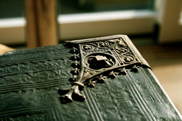
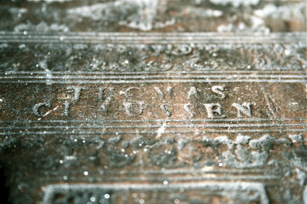
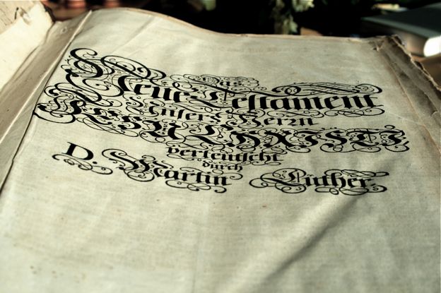
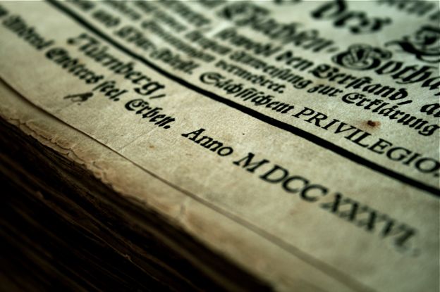
Published • 07 Jun 2008Turning the pages of a 250-year old book has a uniqueness to it that makes it quite different to flipping through what normally sits on my bedside table. Last week a friend kindly gave me the opportunity to peruse a German Lutheran bible, hand made for a Thomas CI Aussen (the A could potentially be another character) and completed in 1736.
Condition
The bible belongs to my friend’s collection of various antiquities, many of which hold within their covers (and sometimes even outside) scores of typographic treasures. The book itself is still in fairly good condition. It looks to have suffered some light water damage, wearing and folding of pages, namely the opening and closing pages. Further into the book are a few burn marks. I’d hazard that these were probably caused by a stray flying ember that landed on the page whilst its owner would have been reading it by firelight.
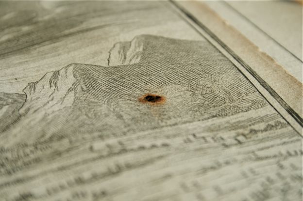
Some of the ink has faded, less in body text and more so in the versals and other ink-heavy areas. This is likely to be caused by the heavier saturation of ink on a relatively small area of the page and the subsequent weakening of the paper on that spot. This is usually exacerbated by pages not drying properly but in this case probably more the cause of just its age.
The binding is in good order, but careful handling never goes astray with older texts. The book is enclosed by wooden covers and protected by imprinted leather.
Typography
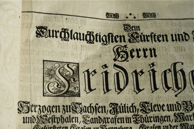
Type in mind, the first thing that stands out is the heavy blackletter. The bible would have been printed with a letterpress, undoubtedly not much different to that the one Gutenberg invented roughly two centuries earlier. I tried to identify the typeface or at least the type of blackletter used but was thrown off; the main body copy features different typefaces in its composition — I have a feeling the printer ran out of sorts.
A sort is a single metal glyph of a given point size and style used in letterpress printing. This is most obvious in the most used characters, note particularly the characters d, o and v:
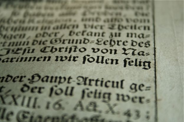
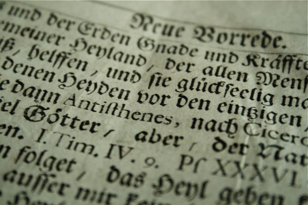
The two faces include a bastarda and a fraktur (see the rounded bowl of the d and shape of the o).
Capital letters amongst the body text are set quite ornately. Nouns and otherwise words that syntactically function as nouns are in the German orthography capitalised and this makes for a larger presence of capital letters in the running body of text than compared to, say modern English. Setting all of these ornately amongst a fairly thick and strong blackletter seems to interrupt rather than aid reading.
Margins are ruled (I’m not sure whether by hand or by the press), which today is quite unusual. I noticed also that the the versals are quite exquisite, and vary throughout the book in complexity and size.
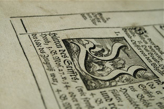
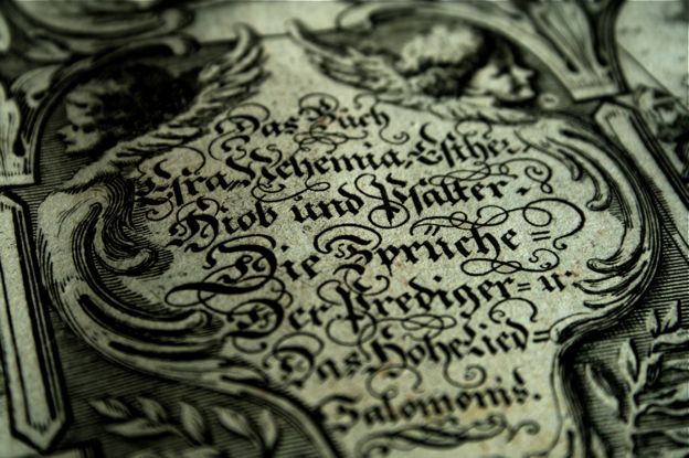
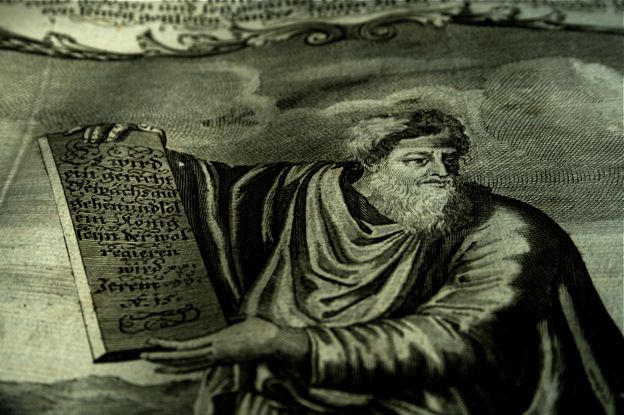
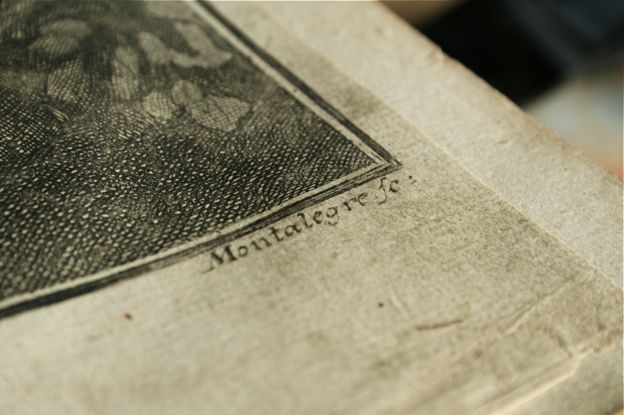
Drawings and other large-scale artwork all received pages of their own and are incredible pieces of work. These would have most likely been woodcut relief printed printed from a copper plate carving, meaning the entire piece would have to be “negatively” carved into a block of wood plate of copper at full size. The drawings were also, probably by some mistake, printed on slightly smaller paper and in many cased preserved better than those the larger surrounding ones.
And that’s it. Have a great weekend (und viele grüße)!